Archive

Tag Archives: design

Image Source: Blogspot

From a Buddhist text called Zen Mind, Beginner’s Mind, the author Shunryu Suzuki writes about the discovery process. Though primarily intended for Zen practitioners, his writings can directly correlate with the practice of the arts and with design. He goes on to say we should all keep our “beginner’s mind” and never become an expert.

In this sense, a beginner’s mind is important because when we are a beginner at anything we have not accomplished anything, thus we have not reached a level where we can say we need no more training. Suzuki says an expert has the tendency to close the mind off to new experiences and to new learning opportunities. When we have a beginner’s mind, we are always accepting of other ideas and open to true learning.[1]

Again, this applies to design so perfectly. With so many rules, principles, and formulated processes to acquire, it’s hard to keep from becoming a self-centered hotshot. But then again, what few disciplines are immune to this risk?

But what’s great about maintaining a beginner’s mind is that introductory exercises in typography are no where underneath any designer. They may help in progressively understanding type and to loosen up designs, but to say that basic exercises are like a singular bag of tricks that can be learned or not only seems to create limits. Basic projects have the capability to broaden any designer at any experience level. It could even be blatantly compared to body building where tanning and work-outs never quite end. Although, one can suppose an athlete can stop after a while, but what kind of a body would that look like compared to those who ritually tone their bodies day after day with bursting as the limit?

Suzuki states that we should never say, “I know what Zen is.”[2] Likewise in design we should never say, “I know what typography is.”

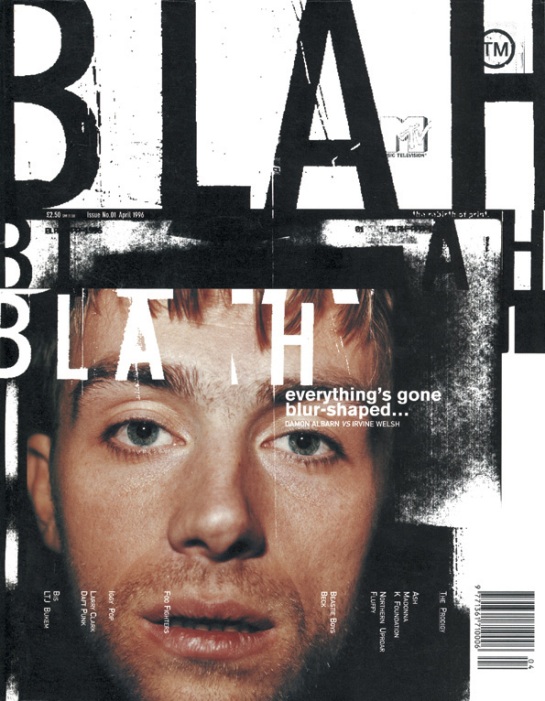
David Carson’s entire body of work seems to represent this kind of attitude. He produces work that’s all over the place, reaching into new areas of discovery not because he knows what typography is, but because he wants to know. If this kind of beginner’s mind attitude was fostered more in graphic designers, our world would be constantly fighting upwards into new territories. Unlike now where so much design plays the neutral card and chooses to blend in and follow the standard.

-me

[1]    Shunryu Suzuki, Zen Mind, Beginner’s Mind. (New York: Weatherhill, 1970), 21-22.

[2]    Shunryu Suzuki, Zen Mind, Beginner’s Mind, 22.

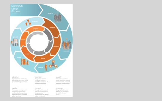
Via: http://www.telono.com/en/services/usability/ucd-process

Because most processes are from one point to another, many tend to follow a single path. Like this one, this path is made up of large arrows and shows a progression through color. Interestingly, this process would cycle again and again until the solution was satisfactory, creating a large circle in the middle of the composition. However, when the solution is finalized, the process ends right next to the beginning, making an easy read, left to right.


Via: http://harrisontsang.com/

This diagram separates the written steps from how they  visually integrate with each other. As you can see, the placement of the information reflects the shapes at the bottom of the composition. It seems to cause a little back-and-forth reading, but overall it seems to pull out a kind of symbol that represents the information, almost like sound vibrations creating patterns with sand.


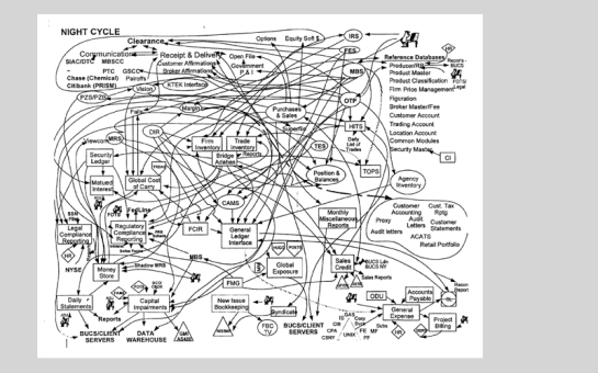
Via: http://bizvalu.blogspot.com/2007/09/lightweight-software-development.html

Whoa. Even though I don’t understand the information or can follow the lines at all, I can see that this process is not quick and painless. Interesting though, the lines begin to cluster up at the top and begin to form patterns. This element could definitely be utilized in another design.


Via: http://designbdk.com/ID_Process.html

This one seems very straightforward and at the same time, it conveys the sense of an endless process, which for many designers can be the feeling. This is achieved through color gradation, arrows, a reduction in scale, and even repeating information.


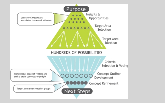
Via: http://www.ideastogo.com/StretchMore/Process.htm

This design shows how a simple idea or problem can generate in the designer’s mind hundreds of solutions that can be developed. Because the job doesn’t pick all of them, designers and clients need to reduce the number, pulling important aspects and smart ideas learned from the exploration process and begin to develop one single plan.

Image Source: pierreneumann

Through many elements of design, a piece can manipulate what you see first, second, third and so forth. It can also move your eye from one place to another. When a piece is designed to have movement, it seems to sometimes give the eye an invisible support system, almost like a monorail. As you look into a composition, rather than trying to find information and bouncing back and forth, the design takes you on a journey, leading you exactly where the designer means for you to go. Whether pleasant or not, movement provides an experience for the eye.

In the poster above, thin horizontal lines provide calm places for text to “slide” left and right. The stacked lines bring to mind how we might see distance on the horizon. Some text on the lines are “closer” to you because they’re larger, while some are further back and small. The larger and more prominent text, “Amphitryon” calls a lot of attention and pulls you off to the right. This and all the other elements of the design seem to be moving off to the right. One specific example is the relationship between “Saint-Gervais Geneve,” “Amphitryon,” and the black dot. From top to bottom, they seem to draw a line parallel to the body in the photo, both moving down and to the right.

-me

Image source: www.squatdesign.com

It’s great to see typography and content working together. The subject, that is natural foods, is embraced by the simple hand drawn type, which in it’s upright qualities, pronounces the product as dignified and clean. This tends to target an audience that wants organic products and feels proud to buy it. But what about the colors? Brown is an obvious signal for people searching for natural foods and as it’s paired with clean photography, it’s sophistication in the market seems to stand out. Warm accents from the vegetables and side panels may… warm up the consumers’ ideas about buying natural foods. Definitely a youthful audience.

-me